Outdated web design techniques that you should forget about

Web design affects the effectiveness of a site, how it is perceived by visitors, and their decision to purchase or collaborate. Therefore, the web resource that you decide to release on the Internet must be visually attractive and comfortable for users.
But how many people – so many opinions! The fact that someone seems interesting and fascinating will simply put off another. In this post, we will analyze the typical and not so web design mistakes, including those that can completely ruin the site. We will give hints on how best to proceed.
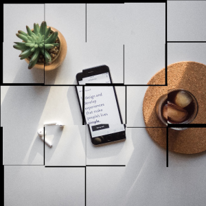
Lorem ipsum dolor sit amet
Using incoherent text is considered one of the most common mistakes newbie designers make. It is important to understand that a lot depends on the situation, and when speed is more important to you, copy-paste is considered acceptable within reasonable limits.
However, if the entire layout is filled with meaningless texts, the customer will not even pay attention to the content and structure of the future site, but he will be much more picky about the design because you have demonstrated a complete lack of interest in his business.
Silly decorations
When there is no single sequence, and different pages get a different design, are opposed in the design, then, at least, the user will be confused. It may seem that the person has switched to another resource. If navigation changes along with the design, important elements move, this will lead to misunderstanding and rejection.
- Maintain the color scheme on all pages.
- Control the vertical and horizontal distances between elements. They must be equal.
- Maintain a single navigation system.
- Maintain the consistency of headings, link designs, icons, shapes.
Complication and tightness
These mistakes often occur for designers when you need to design a website layout with a lot of information. Beginners often try to use every inch of space. Even in the most difficult situations, remember that a user cannot digest a lot of content at the same time. The desire to make the site compact leads to a lack of free space on the page, and the information on such a site is impossible to read (and not want to).
